In 1999, when the Queens Botanical Garden began planning its new visitors’ center, the LEED program that is now the currency of the green-building movement was still a nascent tool. New York City, meanwhile, was in the process of creating its own guidelines for “high-performance” buildings. Especially in the realm of publicly financed projects, the era of green architecture was just dawning.
“ One of New York’s lesser-known botanical gardens emerges as a leader in sustainable design.
By Fred A. Bernstein
In 1999, when the Queens Botanical Garden began planning its new visitors’ center, the LEED program that is now the currency of the green-building movement was still a nascent tool. New York City, meanwhile, was in the process of creating its own guidelines for “high-performance” buildings. Especially in the realm of publicly financed projects, the era of green architecture was just dawning.

Now the newly opened $14 million visitors’ center and administration building, designed by BKSK Architects, is on deck to receive a Platinum LEED rating, making it one of the city’s first structures in that exalted category. Moreover, two years after the passage of local law 86, which requires many new city buildings to receive Silver, Gold, or Platinum ratings, the 16,000-square-foot Queens structure “is showing people that it can be done,” says John Krieble, who heads the Department of Design and Construction’s sustainable-design unit. “It’s one thing to talk about it; it’s another thing to see it here in three dimensions, working.”
Krieble, who inherited the city’s green-building program from Hilary Brown, its founder, says his group is currently advising on 40 buildings. But that’s just the beginning: Mayor Michael Bloomberg’s blueprint for future development, dubbed PlaNYC 2030, contains ambitious environmental goals, for which the Queens building is both trailblazer and laboratory. For city officials charged with making the mayor’s vision a reality, the Queens project “demystifies LEED and green building.”

Its effects are also being felt beyond the halls of government. Unlike other green city buildings—such as the LEED-certified NYC Office of Emergency Management, in Brooklyn, by Swanke Hayden Connell Architects—the Queens facility is open to the public. And it makes lessons in sustainability easy to grasp. On a wet day visitors can watch rain collect on the gull-shaped roof over the outdoor plaza, then spill into a pond that naturally filters the water before it starts a picturesque journey across the site. But this is no mere “water feature.” Conditions in the streambed will reflect past and present weather conditions. “If there’s been a drought, the streambed will be empty,” says BKSK partner Joan Krevlin, the lead designer. “The building helps to tell the story of the site.”
The rainwater-collection system, which keeps runoff out of the city’s overtaxed sewers, is only one of the building’s myriad green features. There’s also a planted roof that serves a surprisingly diverse list of environmental functions. Brises-soleil on the southwest and southeast sides reduce the need for air-conditioning (and, on a sunny day, make the administrative suites feel almost like tree houses). Photovoltaic panels on the roof are already generating 16 kilowatts of electricity. The gray-water recycling system takes water from the shower (itself a green feature meant to encourage bicycling to work), cleanses it in constructed wetlands, and recycles it through the toilets. Then there are the geothermal wells, which use 55-degree water from 300 feet underground to heat and cool the building.
The rectangular building that houses the administrative offices ends in a cantilevered conference room shielded from the sun by a black-locust brise-soleil.
Nearly all these features are reflected in the architecture. The single largest space, an auditorium, is buried under the planted roof, which slopes up from grade level, creating a gentle transition from garden to building. In the adjacent plaza, a dozen angled steel columns support the 3,000-square-foot water-collection roof. The pillars, painted a russet color, suggest a forest. “You have a sense of tree trunks turning into columns,” Krevlin says. Behind the plaza is the main building, with the brises-soleil creating complex shadows. To Brown, one of the project’s great strengths is showing that “environmental initiatives can generate aesthetic richness.”
Eight years ago, making the building green was only one of the garden’s priorities. Another was responding to Queens’s diversity—the borough is a melting pot, with particularly large Asian and Latino communities in the neighborhoods surrounding the garden. Some 75 percent of its visitors speak a language other than English at home. Every morning a large Chinese contingent uses the grounds for the meditative martial art Tai Chi.

“We thought those were two very different missions,” Krevlin says, recalling her initial response to the cultural and environmental mandates. But as the design process got under way, garden officials began meeting with community members to learn about their cultures’ responses to landscape. “Every time we had an event that year, we had drawings out, and we would talk about the ideas and get people’s input,” says Jennifer Ward Souder, director of capital projects. “And what we found out was that every culture had some significant relationship to water.” Soon the garden was looking at ways to incorporate water features into the design of the new building. Souder, Krevlin, and the garden’s executive director, Susan Lacerte, realized that the very features that would draw residents could also become exemplars of sustainability. If water represents continuity and cycles of life, recycling technologies give new meaning to those ancient concepts.
The Queens Botanical Garden has its origins in a horticulture exhibit in the 1939 New York World’s Fair. In 1963, Robert Moses moved it to a 39-acre site near the fairgrounds and gave it a banal beige-brick administration building. Even worse than the building’s design was its location: directly inside the pedestrian entrance on Main Street, a bustling Queens thoroughfare. “When you looked through the main gate, the first thing you saw was a bad building that blocked your whole view of the garden,” says Souder, a landscape architect who was one year out of grad school at the University of Michigan when she was hired in 1998.
Souder’s first major responsibility was to develop a master plan for the garden. She brought in Conservation Design Forum, of Elmhurst, Illinois, and Germany’s Atelier Dreiseitl, whose plan—not surprisingly—called for scrapping the old building. Ashok Bhavnani, a civic-minded architect then serving on the garden’s board, pushed to make the replacement structure green. “We’re an environmental organization,” Lacerte says. “If we’re not going to do it, who is?” Of course, a manifestly green building would help distinguish the Queens garden from its better-established Brooklyn and Bronx siblings.
Because the project would be largely funded by the city, it had to be built under the auspices of the Department of Design and Construction (DDC). At the time, the DDC had a program, created by Brown, then its assistant commissioner and design director, to make new city buildings models of sustainability. But the DDC stipulated that the garden, a pilot project under the program, choose an architect with whom it already had a requirements contract. “We had little choice of who we hired,” Souder recalls. “We got very, very lucky,” she says of BKSK, one of the firms on the department’s list.
BKSK, a 40-person Manhattan outfit with a nearly even mix of residential, institutional, and commercial clients, had recently completed a playground at the New York Hall of Science—the children’s museum just across Flushing Meadows Park—in the process making itself known to the DDC. BKSK’s lack of green-building experience wasn’t a problem. In fact, one of Brown’s goals at the DDC was to mainstream sustainable practices by having generalist firms design green buildings. To be sure, the team (which included Julie Nelson, Paul Capece, Gerry Smith, and Dirk Hartmann) had a lot to learn, not only about sustainability but also about the workings of city government. For example, the building was subject to Wicks Law, which requires each subcontractor on a project costing more than $50,000 to enter into a contract directly with the client (rather than with a general contractor). Accomplishing that was tricky in a green building—the scope of each company’s work had to be defined precisely, but the results had to interconnect. (The gray-water system alone involved the efforts of a landscaper, plumbing contractor, and structural engineer working in concert.) In the process, the architects—and the DDC—gained valuable experience in facilitating collaboration while satisfying prohibitive regulations.
Meanwhile, Souder applied for grants from agencies like the New York State Energy Research and Development Authority. Along with capital, the grants provided a morale boost. “It helped to be able to say, ‘It’s not just a kid out of grad school pushing for this,’” Souder says. “There are city and state programs.” Bhavnani, Lacerte, Souder, Krevlin, and Brown formed a close-knit team, with Brown remaining involved in the project as an adviser and cheerleader long after she had left the DDC. (She now runs the consulting firm New Civic Works.)
One of the project’s greatest assets was Souder’s desire to look beyond green labels. For the brises-soleil, BKSK had selected ipe, a Brazilian wood of unusually high density. But the fact that the wood was certified by the Forest Stewardship Council wasn’t enough for Souder. “I think certification is important,” she says, “but I also think the program isn’t perfect.” Satisfying herself about the wood’s sustainability, she says, would have required “visiting the forest myself and seeing how it’s managed.”
But had she visited and come away impressed, she still would have been reluctant to use a tropical wood. “I don’t feel it’s necessary to ship something around the world,” she says. “Especially since this is a pretty important architectural element that people might want to replicate.”
Finding a replacement required months of research into the density and rot-resistance of North American woods. After talking to hundreds of people, Souder eventually settled on black locust. “It was harvested on Long Island and milled in Pennsylvania, and so far it’s doing the job just fine,” she says. She plans to closely monitor the wood’s performance and, true to form, will share the results with anyone who asks.

Souder also learned that LEED’s point system can have drawbacks. Some parts of the building have carpeting—designed by William McDonough and made of recycled material—because LEED bestows a point for the use of “sustainable” flooring materials. Without the checklist, the offices might have had no carpet, Souder says—surely a greener option.
For BKSK the project wasn’t a moneymaker; according to Krevlin, the DDC fee structure didn’t begin to account for the length or complexity of the project (or the number of consultants that had to be brought in). But the project has given BKSK the credentials to take on other green projects. “It was a great gift to the firm,” Krevlin says.
More than that, it was a gift to a city determined to lessen the environmental impact of its buildings. And it was a well-timed gift at that. Completed just as New York was announcing its ambitious plans for 2030, “It has,” Krieble says, “become a very important symbol.”


 Johannes Torpe and Rune Reilly Kölsch’s sofa MORMOR from HAY received “The Danish Design Prize 2007”.


 These wooden serving trays make great kitchen gadgets. Designed by Danish furniture designer, Anders Lunderskov, these serving trays or Lift-up Trays as they are called, are created from oven-dried basswood and laminated cherrywood.

 From the mixture of both readings, two opposed volumetries, but of equal predominance, can be concluded, the circulations and the rooms (bedroom, living and dinning rooms). In the encounter of these two volumetries it creates a patio that separates the rooms from the services, being this patio both an extension of the dinning room and a first sight to the landscape, after entering the house. The first volume beside the diagonal circulation rests over the second one, that of the rooms, it separates from it, descents with the hill, gets into the pavilion and then exits to follow the run towards the river. The operation, with a high degree of diagrams, implements a house supported over 60 iron piles at an almost 100 meters height over the Mapocho river. The materials used were at sight reinforced concrete, metallic structure and pine saturated with tar paint.

 Casa Buzeta is a vacations family home located south of Maitencillo, over a creek 120mts high from the sea. Since the place presents excellent conditions for kite diving, the house structure has a volume that confronts the wind, boosting the slope and generating a striking sight of the sea. This volume is looking to the orient as and opaque façade, made out of a huge wood sticks look. The side facades have been worked with to round windows, which added to the west inclined façade, seem to be a ship over the sea contrast. Inside the distribution is symmetric, organized by a double high space, where the rooms are. A curved surface, inspired in pump up kite, covered by copper, goes around the house from east to west, forming a room alley, all of the looking to the sea. The materials used are pine insigne in the structure, Oregon pine in the exterior and copper on the covers and fireplace.


 Outdoor storage sheds should be integrated into the surrounding landscape, since outdoor sheds design will complement your home. Modern-shed basic shed design is perfect for storing tools and sport equipment. These outdoor storage sheds can also be converted into a home office or art studio.


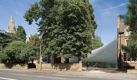
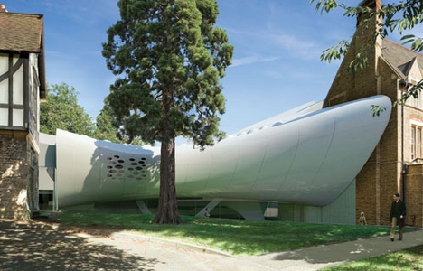
 The centre occupies two historic buildings in a Victorian suburb, and Hadid’s scheme aims to link the pair.
