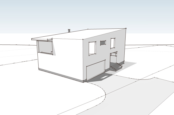
I think the house is difficult to understand from floor plans, yet we'll look at them anyway. Those of you who can read plans well will enjoy the jump from flat-land to seeing the space in your mind. For everybody else we'll look at some better representation further down.
So on the ground floor you arrive at the house at what is a very ordinary suburban situation - a garage door flanked by a recessed entry. This gives way to a small vestibule which is also joined by the entry from the garage. Adjacent to the entry is a nice sized home office/studio space. This is great for home office workers as it is removed from the rest of the house and is even workable for taking meetings without parading through the home. From the entry you proceed up a third of a level to the living room - a small stair.
You arrive in the living room space, a high story and a half space. Straight ahead is a fireplace with niche on either side (actually not drawn on plan), to the left is the kitchen and dining area, which is another level up, and to your right is a more intimate area with a lower ceiling that has a window wall facing out to the site. Take the short steps up to the kitchen and you have a large table area that overlooks the living room. The kitchen has a large island, and another counter at the wall. Above the countertop is a large window looking out at the front of the house. At one side is a pantry space and another short stair that brings you up to the bedroom level.
The bedroom level has short hall/balcony that overlooks the living room. The two bedrooms share a bath room and have windows overlooking the side of the house where the entry door is located. At the end of the hall is yet another small stair that takes us up to the master bedroom level. The master bedroom bridges back over the living room on the left, and to the right has a large area for closets and master bathroom. Unlike the other bedrooms it is very isolated and feels removed from the rest of the house.
This section view above gives you a pretty good idea of all these level changes, but this cut away view is probably even better for understanding the layering.
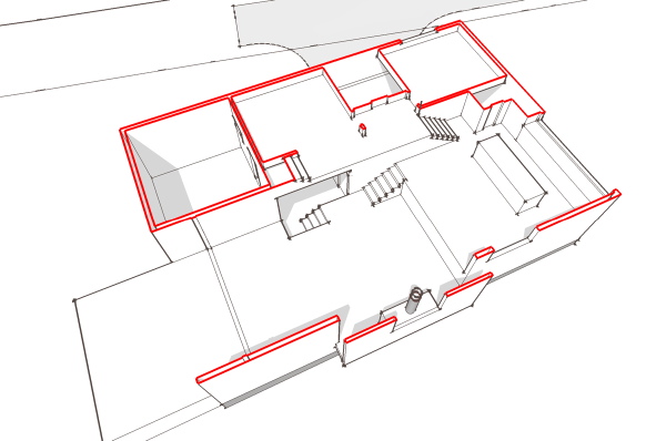

And here is a rough walk through of the sketch model which will give you the best representation of the space and how the parts relate to one another.
I liked this solution as its simple geometry was efficient and economical yet it provided a very dynamic interior space that served the program. Right now its my favorite candidate for conversion into a stock plan.
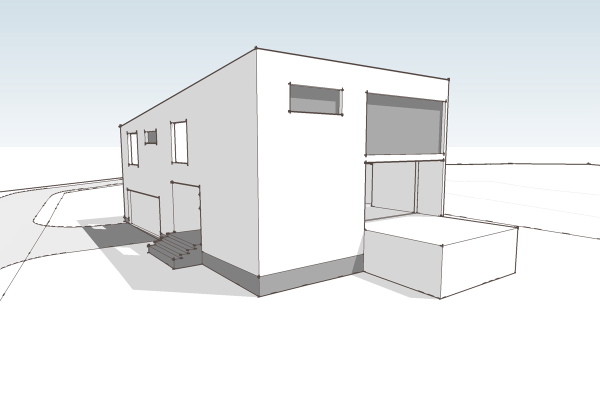
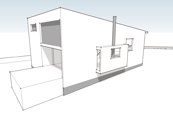
And here is a rough walk through of the sketch model which will give you the best representation of the space and how the parts relate to one another.